Woo hoo! Up pretty late (0115 EST). Feeling good, but shouldn't have had coffee after dinner. I make GOOD coffee, so I'm still feeling it.
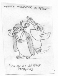
Anyhoo. I was jazzed up, so I drew, inked and colored a new version of the Evil Nazi Jetpack Penguin! I've been thinking that the first two words are sort of redundant. But, it just rolls of the tongue better (looks like Mr. Eastman was on to something!)
It's almost an improvement meme if you look at the original version from Feb 2007. If I didn't already tell the story, it was done for a "Monster Of The Week" series I did for a co-worker at my last design job. :
Then came this guy from 2008. Now, I think "Ewwwww!":
I think I needed the improvement meme thing. I've been down in the dumps from the lack of design job callbacks. Oh, well, at least I've got some evil penguins
Listening to while posting: "Do What You Want" by OKGO. In my head actually. I watched the video twice today for some reason. OKGO is my guilty pleasure. I'll have to go see Devotchka next week to gain back my indie cred ;)
Sunday, March 20, 2011
Sunday, March 13, 2011
heavy, then light
First, my heart goes out to those affected by the horrific devastation in Japan. To watch the videos and see the before and after photos is to see power beyond our imagining. I don't know how they'd begin rebuilding their cities, their towns, their homes and their lives. A blogging buddy of mine lives with his family in Japan. He wasn't near the devastation and is safe, but Japan is not that big a place and he felt the quake and is still dealing with its repercussions. Stay safe, Pandabonium.
Now, to lighter stuff. I started work on the first of my pinup/covers for the bear cop comic. It's tentatively titled "Partners Vs. Crime".
Sweet Enemy picked the one of the five to start with. I know other people liked different ones, but I have to listen to SE.
This was an ambitious project and as such, has small successes and small failures. I think the overall composition turned out well and the perspective is not too bad. I think I did a good job of drawing the cop from a photo (of me, actually. I am my own stock photographer). He looks a bit stiff, but that's to be expected from photographic drawing. I needed to use the photo reference as part of my learning clothing wrinkles; the figures will get more lively as I improve.
I won' mention all of the failures except to say that I might revisit the bear's expression. I don't think it works. I kept the background free of lots of shading to reduce its impact on the foreground. I'm not sure if that was successful. I'm also not too sure of the depth of the piece. Are the cops and cars in the background too far away?
Listening to while posting: "My Intention" by Ape School
Labels:
anthropomorphic,
comics,
ink,
partners vs crime,
police
Thursday, March 10, 2011
Three Things
1) Second attempt at sexy. With some feedback from pinup artist Becca and some others (including my dad. Weird), I got back to work. This one is closer. Not there, but closer. I seem to have forgotten to use one piece of feedback that Becca gave me: exaggerated features often make a character look more natural. Looking now, the piece would definitely benefit from a little exaggeration. The poses and composition, however, I feel are a bit better. Sweet Enemy says when I finally get a drawing I'm finally happy with, she'll go all James Jean on it. That should be sweet. Here it is:
2) I spent the morning at my local independent bookstore (LIBS) with an double Americano and sketched out some potential covers/pinups of the stars of Interrogation 101. Anyone got a favorite? If not, I'll probably do them all for the inking practice.
3) Serendipity. This has nothing to do with art, but I thought it was neat enough to mention. Last Wed. I was heading back from my LIBS coffee morning. At a certain point on the way home, I had to stop for a bit because a wide load truck was negotiating a sharp corner. The truck was carrying some massive wind turbine blades! They were huge and all sci-fi-looking.
Yesterday, I was heading home from my LIBS coffee morning and at the same point in the road at around the same time, guess what? Yup. Another wide load truck transporting wind turbine blades! Freaky, no? Good thing I don't believe in coincidence. I guess that Wednesday around 11 AM is Wind Turbine Blade Truck Time in Jericho, Vermont!
Listening to while posting: "Shadows" by Au Revoir Simone
Wednesday, March 9, 2011
Postah
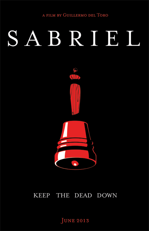
To keep my design chops up, I occasionally do posters for fun. For this challenge, I took one of my favorite books and tried to do a two-color poster in two hours. That's sketching, finalizing, comping, and readying for print in two hours. I did it but, whether or not it's an effective poster is up to you, the viewer. The bell was made by me in Adobe Illustrator and the font is Mrs. Eaves.
And, yes, I feel that Guillermo Del Toro is the only contemporary director who could do Garth Nix's fantastic novel justice.
Listening to while posting: Secret Agent Radio station on Soma FM
And, yes, I feel that Guillermo Del Toro is the only contemporary director who could do Garth Nix's fantastic novel justice.
Listening to while posting: Secret Agent Radio station on Soma FM
Labels:
garth nix,
graphic design,
posters,
sabriel,
typography
Sunday, March 6, 2011
semi-fail!
I spent the the day drinking good coffee and drawing. I really mean I spent the day drawing. I started at 9:00 am EST with a tiny, incoherent thumbnail, sketched and sketched and finished inking it about 7:30 EST. I learned a lot. I learned how to work with a new nib. I learned my Pentel brush pen hack works pretty well. I learned that things in my head still look better than what they end up as on paper. The most important thing I learned is this:
I cannot do sexy. Not even slightly sexy. That bothers me. I like sexy, I appreciate sexy, I can definitely tell sexy from not-sexy. Unless, of course, I have to draw it. I think I can draw attractive women pretty well, but when it comes to making them sexy, I fail miserably. It's almost embarrassing, actually. I mean really embarrassing. Like a karaoke singer who really thinks they can sing.
So, in the hopes that someone will tell me what I can do to make this even slightly sexier, I'm posting it. The idea was to do a cheesy, silly, sexy pinup thing that might have appeared on a Heavy Metal magazine cover in the 80s. I think I got two out of three. So, here it is.
Technically, it's got some good points and I really learned a lot. But, please, if you know sexy, let me know how I can improve. Is it the composition? The style? The poses? The entire idea? Help!
Here it is as a cover, just for fun:
Listening to while posting: "Jinji" by Tomoyasu Hotei
Thursday, March 3, 2011
small stuff
AndreZero is still writing the Obscure Tales story that the Deneb Princess appears in.
In the meantime, I've started fleshing out some more concepts to throw at AZ. One is an overly ambitious sort-of-superhero-y team book. The other is something I've been thinking of for a while. It's a story of an Alternative WW2 where Gen. Billy Mitchell wasn't discharged to die at age 59, but was actively listened to by everyone about the uses of military aviation and (and this is probably the farthest fetched part), became and advocate of women combat pilots.
The idea came about when friend named her graphic design company after a certain plant, the Cobra Lily. I thought that Cobra Lily would be a great nickname for a pilot and so built an improbable alternative universe out of it.
In doing some sketches for the cover of the fake first issue of Cobra Lily, I decided to work on a patch she'd wear on her jacket. I came up with the backstory that Gen. Mitchell created his own training unit and trained women to fly combat. After they'd proved themselves against men, they were shunted out to active units. All of the "plankholders" of Mitchell's training unit wore their patches with their nickname "Mitchell's Molls". The character is loosely based on Fifinella the mascot of the WASPs.
These were sketched on paper, scanned, vectored (in Illustrator) and digitally colored (in Photoshop)
Clean version:
Slightly dirty version:
That's all. I may have a cover by the end of this week. Tomorrow night we're heading to an art opening that Sweet Enemy's taking part of. It's at the super-cool S.P.A.C.E Gallery in Burlington. So, I'll be hob-nobbing with a bunch of wicked cool folks who are much more talented than me. If you're in town, stop by.
Listening to while posting: Porcelain by Moby
Subscribe to:
Posts (Atom)